My other interests besides art and making projects are running,for wheeling,wii, camera, and jumping on the trampoline.
scribble art
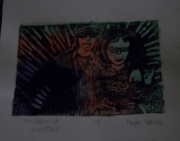
9/23/12
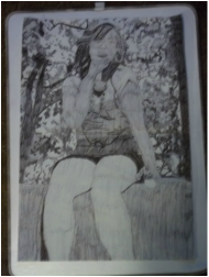
I did this image of myself because I like to put my projects to the limit and I thought it would be a great picture to do this technique. I feel like I did really really great on my project and this picture reminds me of happy times in my life. I also didn't know there was different shades in pen when I first did it. Honestly this picture is probably the best I've ever drawn a human. I did the background because it was a great challenge that I was willing to take and it fulfills the background. I loved my drawing and so did my family they never knew I could do such an amazing thing in just pen. And I used every texture out there I think that has to do with pen because this picture had so many shades of pen put into it.
News paper painting
11/1/12
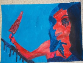
This is my painting of murder and I chose to do it because lost of people near me are either dead or murdered in the last month. This is a horrible problem that happens a lot and I thought it would be a good subject to do. I like my painting at first and didn't think it would turn out to be so good and it looks great with the text, newspaper, texture of colors and I really think it looks like murder. I believe I stuck to the right colors for my project. When I first found my picture it was black mostly so I know I chose the right colors. And I'm not into guts so it was hard to find a picture for me to do that wouldn't give me nightmares. The thing beside the girls arm is blood if your wondering and the stuff falling from her eyes is eyeliner she was wearing but got smeared. Also this picture you can feel the temptation in her face that she really wants pay back on someone. But the light from my camera I think made it blend in because when you loook at my picture in real life the background doesn't blend with her hair.
My Building drawings
1/16/13
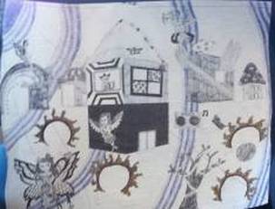
This is a building drawing that I Did. I chose to do it in pen because I thought it would give it a better look than pencil would. I have a lot of different in it like:fairies, fire karaoke, Mario, an space boundary in purple. Its supposed to be a peaceful like land with lots of ideas combining together to make something new. Fairies are a high interest to me so that's why I added and also people wouldn't think to do that because you don't really hear much of them. My buildings I thought were really cool because they all have something unique on them like:rainbow coming out of it, A spider on top of one, putting wings on one, much room on top of another. There all amazingly interesting.
hallway drawing
12/26/12
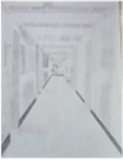
I like the hallway drawing because it looks just like the actual hallway. Like how my shading really brought it out. I used so many different shades of pencil to make it perfect. You can't really see that there a computer desk way deep into my drawing. This project was hard because I had to keep erasing my box at the end of the hallway. To get the rest of the walls and doors into it.
charcoal fabric drawing
1/15/13
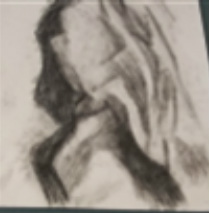
I love using charcoal and making fabric on the paper. The charcoal made it look so cool and stick out so nicely. That was one of the first times I used charcoal in my life and it was a great. This picture is originally a Manichean with fabric on its shoulder and we only had to make sure the fabric stuck out and that no one knew it was a Manichean.
selective painting
1/21/13
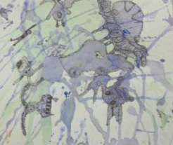
This is a water coloring painting where you try to see things in your drawings and pull them out. I pulled out a lot of cool things in my drawing like a crab and whats sad is the thing that stuck out the most in perfect shape was someone hanging themselves. I was a little scared at that moment. Before I did this project I thought I would not see anything honestly in my painting.
This is my final still life drawing
1/21/13
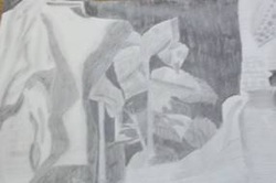
This drawing is really an improvement my my first still life drawing. My art teacher taught me some new skills on how to be a better drawer and I really think it worked. This drawing is a favorite of my. Also you can't pull out all amazing shadows and shapes. You can also tell what things I drew. The drawing beneath is what I drew before I devoted skills.
My word Inspired Jan,2013
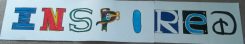
I chose to do this word because I use it a lot in my vocabulary. I have a lot of singers I like who inspire me everyday to keep going and not give up because like feel they want to see me excel and improve. In this word I had to add logos from other commercials and signs. (I, IBM) (N, North junior High School) (S,subway) (p,Pokemon) (I,i hop) (R,R reader) (E,internet) (D, Disney) But with all of the logos put together it made my word look really cool.
Candy wrapper painting Feb,2013
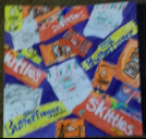
I know this painting turned out nicely because it looked great. The wrappers I used were butterfingers,skittles, starburst, blow pop, gum, kit Kat, and valentines candy wrappers. The purple in the background really made it stand out great. The painting value and time was worth it. The colors look exactly like the ones used on the originals.
Scratch board of Dragon Feb,2013
I chose to do a dragon for my scratch board because I believed it would give a good effect to it. The dragon looked very magical and dangerous. I went into as much detail as I could and lots of comments from kids saying that's amazing your really good. Also the assignment was to do an animal. If that wasn't the case I would have done a fairy.
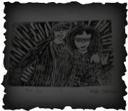
Printmaking Project Mar,2013
These two prints are of me and one of my best friends named Zaria. In this picture me and Zaria were camping. We both were trying to disguise yourself so her parents wouldn't know and we'd sneak out of the camper and surprise them by the fire. But her dog caught us and started barking so that plan FAILED . This picture was supposed to represent love, laugh, or life. I chose to do laugh. I'm on the left side. Zaria's on the right wearing a wig and glasses. Both these prints were made from my original I only have one of each kind. The first print was black on white paper. Second is watercolor. Third is color pencil. Fourth was two alternating things. Fifth was white on black.
Lyric painting April, 2013
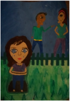
The song that represents my painting is Because of You by Kelly Clarkson, it is one of the most saddest songs I've ever heard and I thought about how much and wanted to draw the pain. It was so alive and real. The heartbreaking song made it so powerful to do a painting on. I made this picture to represent parents fighting and the kid is sad because moms taking it out on her. Now that the girl is grown up she's trying to say in this song that she will not let her kid go through the same thing that she did. My lyrics are on the outside of the girl with is why I had to make it dark there. My light source comes from the right side. I loved the painting it is just so powerful and brings out all of the emotions going through the painting and I made it clear that people were crying in my painting.
2 in one picture May, 2013
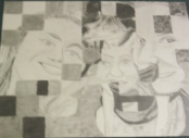
I love my drawing because it turned out really amazing. The two pictures I weaved together were me and my sisters and my dog at Christmas time wearing a Mrs. Claus dress. All my darkest shades in my picture are mostly from my dog. My light source was coming from the top of my picture with me and my sisters. I am the person furthermost to the right of the picture. My littlest sister is in the middle of me and Candice. We were out on a paddle boat that day and Candice decided to bring her camera. And my dog picture was taken by my mom because she thought it would be so cute. I am truly glad that I decided to combine these pictures because the shading looked excellent and it really did look 3D. The 2 pictures combined made it look like a family picture. I liked it so much much I signed in the bottom right corner.
